
10 inspiring websites by female (+) owned creative businesses
When you’re creating a website for your small business, it can help to gather inspiration from other people’s websites. It’s something I absolutely do when I’m changing up my own website, and I’ll always get clients to send me some examples of websites they like when I’m designing for them.
To make sure you’re using websites for inspiration (and not outright copying them), take notes on what it is you particularly like about the sites you find. Are they creating a feeling of spaciousness with lots of white space? Is it the fact there is good brand cohesion with the way they’ve used colours? Is there a sense of playfulness or calm that you want to recreate?
If you can be clear on what specifically you like on someone else’s website and why, it can guide you to create something in your own style - taking inspiration from, but not copying, other people’s websites.
In this post I’m sharing 10 inspiring websites by female (+) owned creative businesses. I’ve added the ‘+’ here because I don’t actually know how most of the lovely creatives listed identify, but I’ve tried to focus on people who use a more gentle and feminine approach to business and/or websites, but who don’t lean into overly girl-y design (no ‘girl boss’ here).
I’ve shared websites across a range of platforms, showing that there’s no better or worse / right or wrong website platform to use… only the right one for you.
Take a look and see what you can achieve….

1) Sarah + Maude
Bespoke letterpress stationery services & an online store selling cards.
Feel: minimal, clean
Platform: Squarespace
What’s done well: This is simple design, done really well. It uses a minimal colour palette, clean fonts, consistent style & plenty of white space to create a sophisticated look and feel across the whole website. It’s a brilliant example of how you can use simple branding and beautiful photographs to let the product lead on your website.
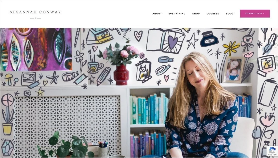
2) Susannah Conway
Online store selling courses & workshops.
Feel: spacious, simple
Platform: Kajabi
What’s done well: This is a great example of how to strip down a website for ultimate simplicity, whilst still maintaining complexity, character and brand voice. It’s incredibly easy to navigate the site, there’s excellent design consistency across the pages and real depth of feeling shines through with well-crafted copy and images.

3) Calm Business
Online store selling courses & workbooks.
Feel: calm, gentle
Platform: Squarespace
What’s done well: A shining example of the gentler approach to business, the Calm Business website shows how you can use animation on a website to create flow and movement, without it feeling jarring or overwhelming. A website doesn’t have to be fast or use pressurised selling tactics to be effective, and the Calm Business shows how.

4) Joanne Hawker
Online store selling cards and stationery.
Feel: light, airy
Platform: Shopify
What’s done well: This website takes the main selling point of the website (scratch cards), and brings it to front and centre on the homepage. You immediately know upon visiting the website exactly what you’re in for, and there’s a direct link to be able to find out more. It also has great categorisation of products, so you can quickly and easily find what you’re looking for.

5) The Travelling Bookbinder
www.thetravellingbookbinder.com
Online store selling digital courses, in-person workshops and books.
Feel: nostalgic, easeful
Platform: Wordpress
What’s done well: This website really makes the most of photos and videos to set the scene and create a feel of quality to everything on offer. It’s a lovely example of how simple and sleek fonts can create a sense of sophistication, and also that sometimes images speak louder than words.
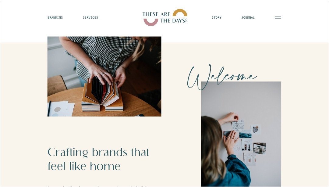
6) These Are The Days
Brand design services.
Feel: spacious, simple
Platform: Wordpress
What’s done well: This is brand implementation at its best, which isn’t surprising really coming from a brand designer. The website shows how you can use multiple different fonts and colours across a site well to create synchronicity, as well as how you can utilise a logo symbol in small ways around your website (see if you can spot where the logo curves are replicated and reflected around the site).

7) Lisa Congdon
Artist portfolio and online store selling art prints and merchandise.
Feel: colourful, playful
Platform: Shopify
What’s done well: This is another great example of how to let the product lead the way. The bold, bright and colourful artwork sets the tone across the whole website, and the photography does the heavy lifting in showing what’s on offer. Text is clear and to the point, and extra animations on the site reflect the illustrative style, adding to the overall website feel without dominating.

8) Sarah Wayte creative
Copywriting and brand photography services.
Feel: vibrant, bold
Platform: Wordpress
What’s done well: Great copy is what makes this website really stand out for me. All the text around the whole website is infused with Sarah’s personality, making it really clear who she is, and what you can expect from working with her. She also uses titles really well, so you can grab the key information easily at a glance.
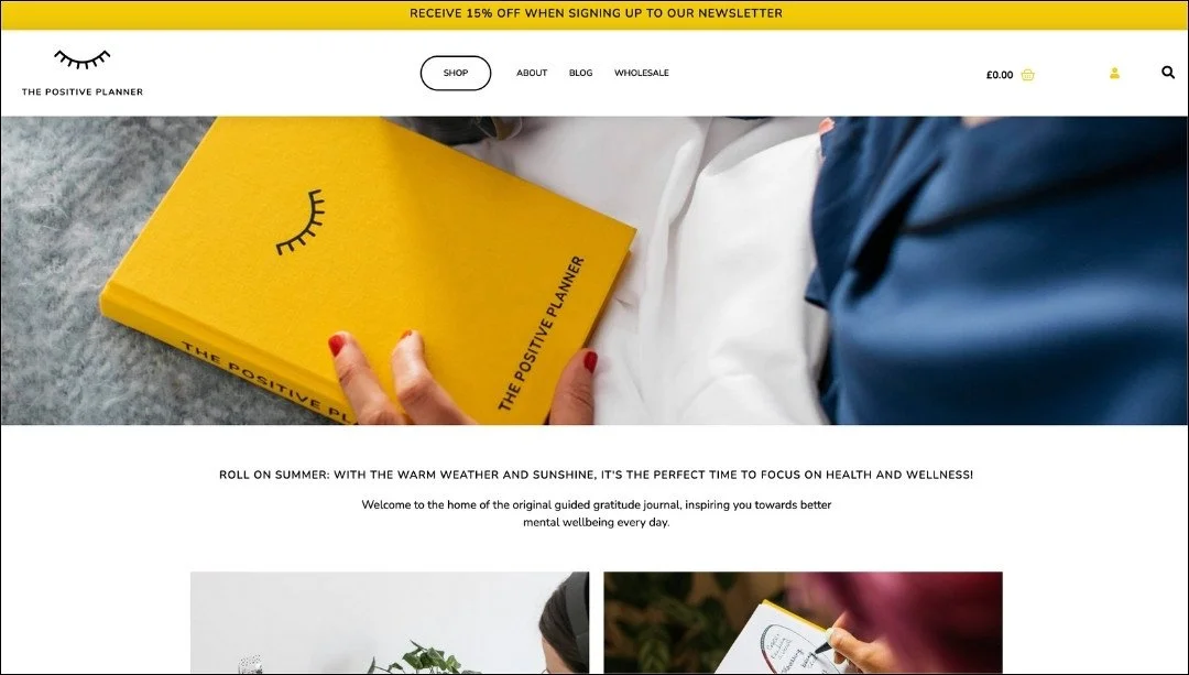
9) The Positive Planners
Online store selling wellbeing planners.
Feel: positive, focussed
Platform: Wordpress
What’s done well: This is a lovely example of how you can use just 2 brand colours and one font to create a simple and consistent website feel. If you have photographs on a website which are providing a lot of colour, it can work really well to use just one or two colours on the website itself (e.g. for highlights, buttons etc) so the photographs really stand out.

10) Alice Stewart Jewellery
Handcrafted jewellery. Includes an online store for physical products.
Feel: soft, natural
Platform: Squarespace
What’s done well: This website uses a beautiful balance of gorgeous photography and well-honed copy to create a real sense of sophistication and quality. The simplicity and spaciousness of the website means you can easily find what you need, and come away with a sense of calm.
So which websites did you like most, and why?
Let your answers guide you to creating a website that beautifully reflects you and your business.
If you’re in the process of designing or re-designing a website and need an extra hand, why not check out my website design service here.